Information Events
News and Blog
Virtual Tour
Summer Camp
Downloads
Alumni Community
Career
language
EN
DE
About Us
We are Institut Montana
Our School
My Place to Grow
Our People
An international community
Our Campus
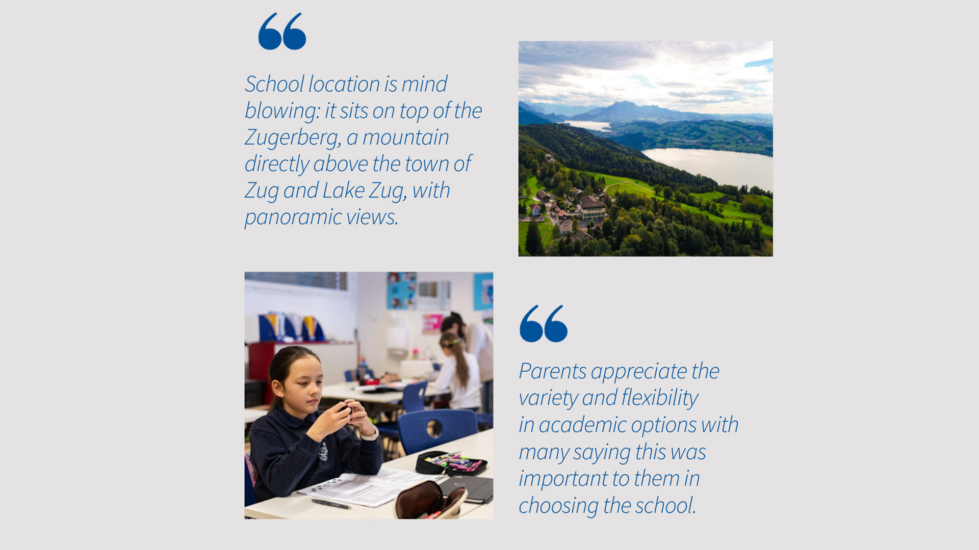
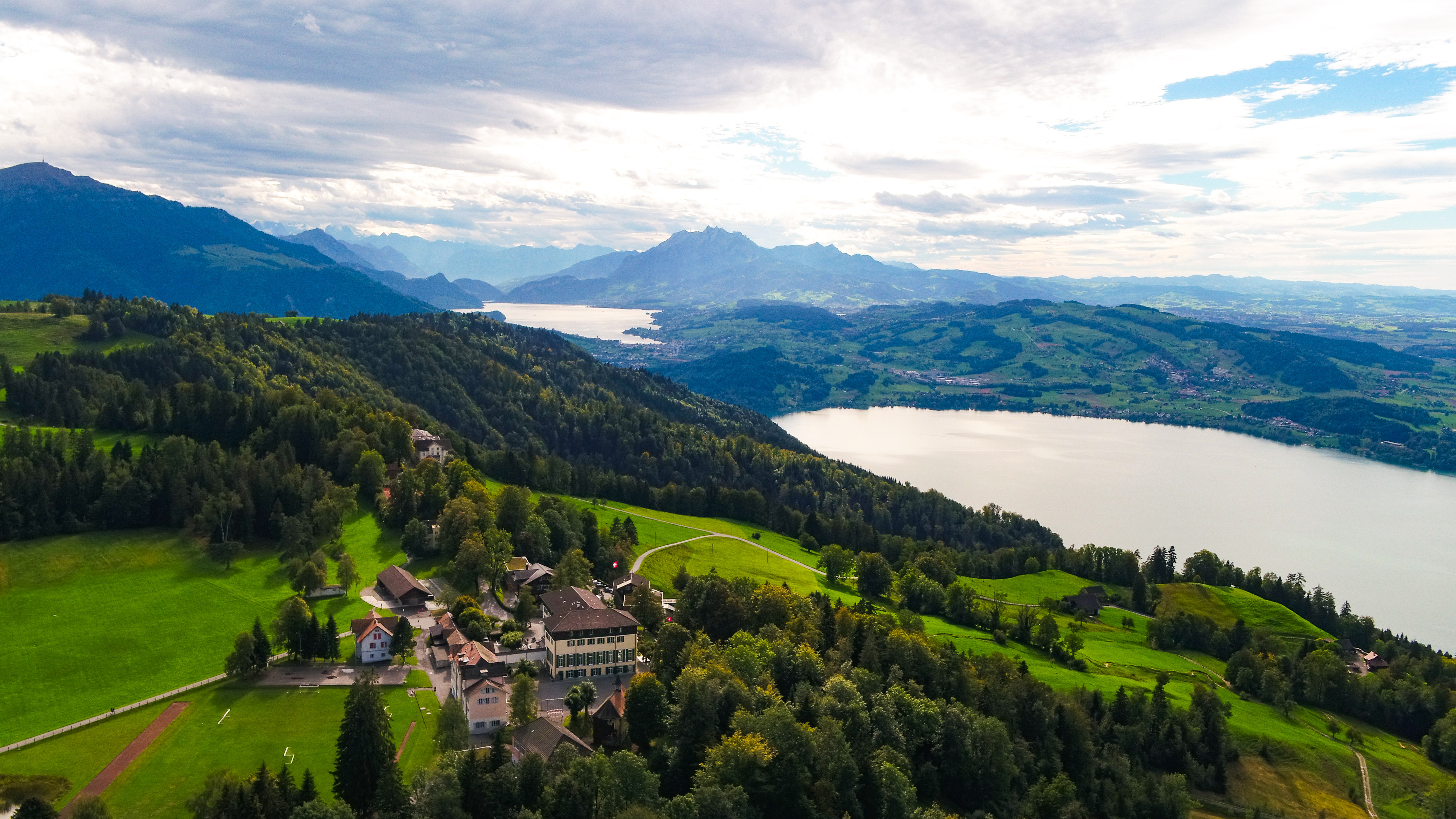
Located in the heart of Switzerland
Since 1926
Our History
The school on the Zugerberg
From 1926 to Today: Institut Montana Celebrates 100 Years.
School Updates
Events
Academics
Overview
All Programmes
Grades 1-12
Primary Education
Bilingual Primary School
Grades 1-6
Secondary Education
Bilingual Secondary School
Grades 7-9
Swiss Gymnasium
Grades 7-12
International School
Grades 6-12
From 1926 to Today: Institut Montana Celebrates 100 Years.
School Updates
Events
Boarding
School Life
Beyond the classroom
Co-curricular Activities
Be active, creative, inspired and compassionate
Performing Arts
Music, private instrument lessons, choir and drama club
Model United Nations
Put yourself in the situation of representing UN Member States
We take great care
Health and Well-Being
Counselling and confidential student support
Dining Services
Eating and living like at home
From 1926 to Today: Institut Montana Celebrates 100 Years.
School Updates
Events
Admissions
Join the Montana family
Admissions Process
Start your journey
Fees
General and additional costs
Contact our Admissions Team
Get in touch
We are looking forward to getting to know you
Meet us around the world
Montana on the Road
More about national and international fairs
From 1926 to Today: Institut Montana Celebrates 100 Years.
School Updates
Events
100 Years
This is a search field with an auto-suggest feature attached.
There are no suggestions because the search field is empty.
calendar_month
School Calendar
calendar_month
School Calendar
language
EN
DE
This is a search field with an auto-suggest feature attached.
There are no suggestions because the search field is empty.
About Us
arrow_back
About Us
We are Institut Montana
Our School
My Place to Grow
Our People
An international community
Our Campus
Located in the heart of Switzerland
Since 1926
Our History
The school on the Zugerberg
From 1926 to Today: Institut Montana Celebrates 100 Years.
School Updates
Events
Academics
arrow_back
Academics
Overview
All Programmes
Grades 1-12
Primary Education
Bilingual Primary School
Grades 1-6
Secondary Education
Bilingual Secondary School
Grades 7-9
Swiss Gymnasium
Grades 7-12
International School
Grades 6-12
From 1926 to Today: Institut Montana Celebrates 100 Years.
School Updates
Events
Boarding
School Life
arrow_back
School Life
Beyond the classroom
Co-curricular Activities
Be active, creative, inspired and compassionate
Performing Arts
Music, private instrument lessons, choir and drama club
Model United Nations
Put yourself in the situation of representing UN Member States
We take great care
Health and Well-Being
Counselling and confidential student support
Dining Services
Eating and living like at home
From 1926 to Today: Institut Montana Celebrates 100 Years.
School Updates
Events
Admissions
arrow_back
Admissions
Join the Montana family
Admissions Process
Start your journey
Fees
General and additional costs
Contact our Admissions Team
Get in touch
We are looking forward to getting to know you
Meet us around the world
Montana on the Road
More about national and international fairs
From 1926 to Today: Institut Montana Celebrates 100 Years.
School Updates
Events
100 Years
Information Events
News and Blog
Virtual Tour
Summer Camp
Downloads
Alumni Community
Career
Stay up to date
Latest News & Stories
All
School Updates
Events
Achievement
summer camp
team member
Alumni
Montana Team
Student Life
Student Feature
Performing Arts
Model United Nations
Family Relocation
Summer School
Education Models
Show only News
From 1926 to Today: Institut Montana Celebrates 100 Years.
School Updates
Events
Recognition on digital citizenship and AI for Institut Montana
School Updates
Achievement
Let's celebrate 100 Years of Institut Montana
School Updates
Events
Summer Camp 2026
Events
summer camp
Our special “100 YEARS” Jubilee city bus is here!
School Updates
Events
Montana reaccreditated by CIS: A community celebration
School Updates
Achievement
Zug Exhibition spotlights our art teacher's painting
team member
Achievement
A golden reunion on the Zugerberg
Events
Alumni
Summer Camp 2025: What happens when teens interview a Hollywood star?
School Updates
Events
summer camp
Alumnus Geza's kitesurfing adventure on Blick
Alumni
Achievement
Behind the Scenes of 'Believe'
School Updates
Our teacher Markus shines at 45th London Marathon
Achievement
Montana Team
Alumni und winter sports athlete Helena
Alumni
Achievement
2025 IB Visual Arts Exhibition
Events
Achievement
Justine's debut: "I'm proud of you"
Student Life
Achievement
Alumni Feature Luisa and Dominic: "We have lovely memories of Montana."
Alumni
Michael: Harmonizing academics and music passion
Student Life
Student Feature
Montana team in race action
Achievement
Montana Team
Our unique "Zugiblubbi" Cable Car Winter Musical
Events
Performing Arts
The Singing Christmas Tree
Events
Performing Arts
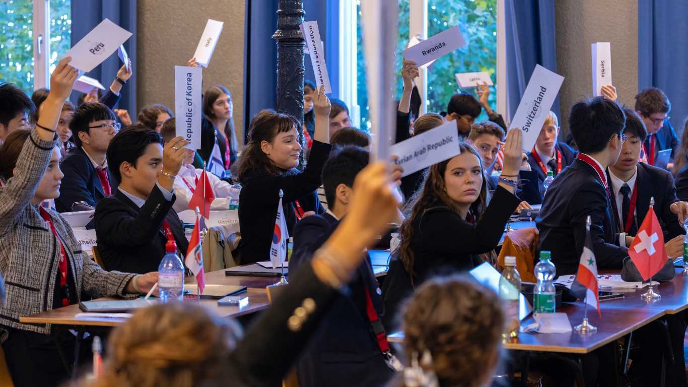
Young diplomats on our 2024 Model United Nations conference
Events
Model United Nations
Our young "rock star" Thomas
Alumni
The joy and highlights of our Summer Camp
Events
summer camp
Behind Joshua’s successful journey
Student Life
Achievement
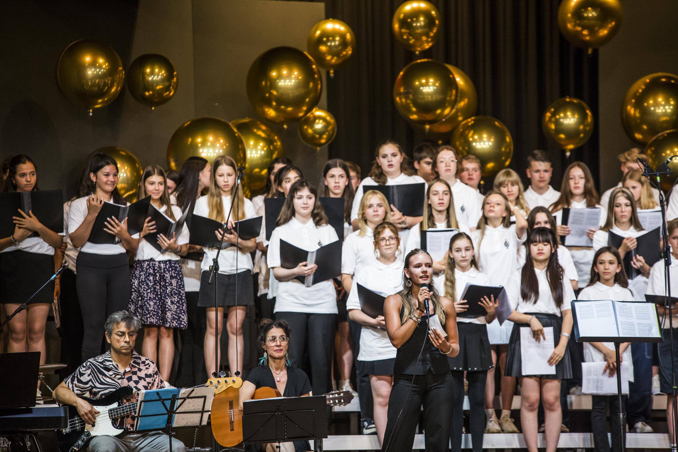
Summer Choir Concert 2024
Events
Alumnus and Film director Marc Forster's interview on Schweizer Illustrierte
Alumni
Our 2024 Spring issue of Student Magazine
Student Life
Our students competing at International Mathematics competitions
Events
Circus Magic on the Zugerberg
Events
Swiss Actress Géraldine Dulex: From Baar to Broadway Dreams
Alumni
Institut Montana Open Day
Events
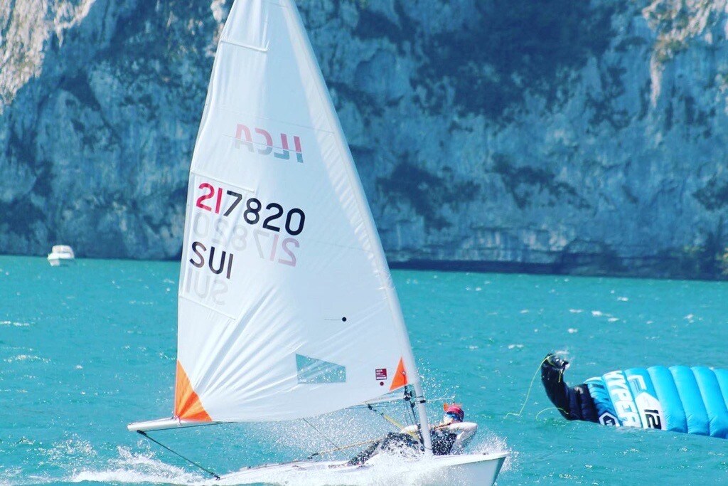
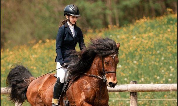
Ava: A sailing star who aspires to be a doctor
Student Life
Student Feature
Parent Feature: Interview with a “Super Mom” Julia Ramlogan.
Family Relocation
Future Day 2023
Events
The rainforest makes its entrance on the Zugerberg!
Summer School
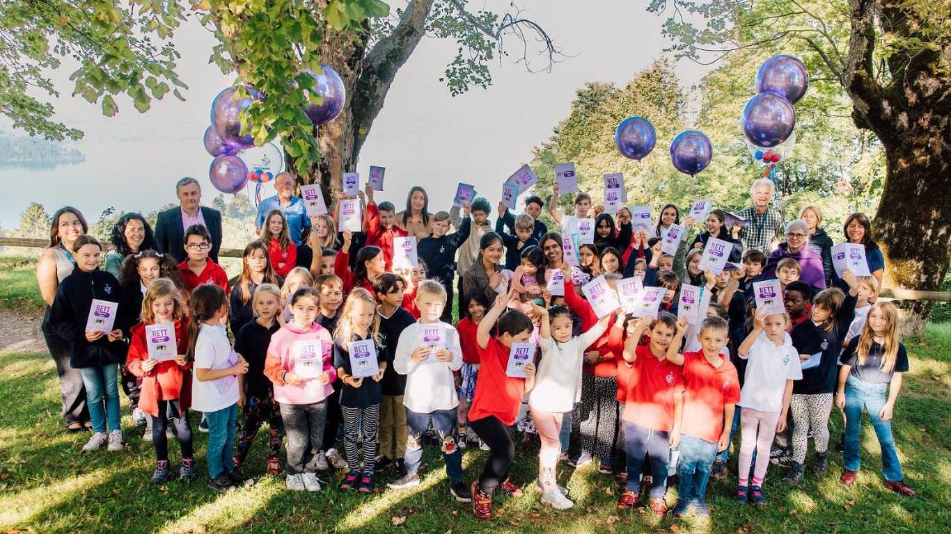
Our Commitment to RETT Syndrome Awareness Month
Events
We hosted 2023 Model United Nations conference
Events
Our first-class review on The Good Schools Guide International
School Updates
Two insightful poetry sessions with Matt Abbott
Education Models
Another milestone for Institut Montana
School Updates
Making a Meaningful Difference
School Updates
Alumnus Feature Cary Harrison: “If you like your teacher, you like what they say.”
Alumni
Following a Passion in AI: The Story of Joshua
Student Life
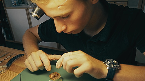
Conrad's Journey to Constructing his Own Timepiece
Student Life
Emma’s Mission for Animal Rescue: Crafting a Promotional Strategy
Student Life
The Magic of Engagement: Insights into Why Our Students Love Learning with Us
Education Models
Alumni Feature Oscar: "My 3 years at Montana have been some of the best if not the best of my life."
Alumni
"An international heaven above the clouds where I made some of my lifelong closest friends"
Alumni
5 Reasons to send your child to the Montana Summer Sessions
Summer School
With open eyes through the world
Education Models
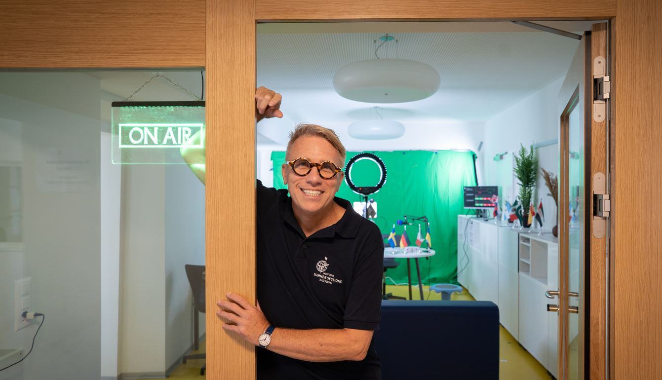
Radio “M” Out of Neutral Switzerland — Not Your Grandfather’s Radio Station
Summer School
11 advantages of attending a boarding school
Student Life
Education of the 21st century – Transdisciplinary learning in a bilingual elementary school
Education Models
The summer of a lifetime
Summer School
Why is bilingual education important? Welcome to the bilingual classroom
Education Models
Institut Montana on the cover page of The Knowledge Review as Switzerland’s 10 Most Valuable Schools for 2019
School Updates
Teacher Feature: Hina Agarwalla, the agent of change
Student Life
4 Benefits of Small Class Sizes
Education Models
Geza Scholtz on International Friendships
Alumni
Guido Bissig: The William Tell of Music
Education Models
Mansour Al Zamil: One of the Children of the Clouds
Alumni
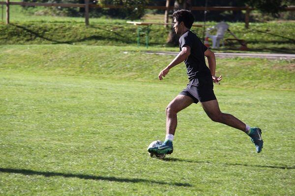
Montana student sets out to be a professional football player
Student Life
Celebrating our 90-year Anniversary Institut Montana Zugerberg
Events
arrow_right_alt
.png)
.png)


.png)